
Agreed, the first is Worboys.Chris Bertram wrote: ↑Tue Apr 13, 2021 12:57Your second one looks like a real PW, the first one not - the font is Transport Medium and the corners are too rounded, it's a Worboys route confirmation sign with no destinations.skiddaw05 wrote: ↑Tue Apr 13, 2021 12:36 I'd value an expert opinion on this sign, to me it has a bit of a PW look about it. For comparison until recently there was what I think could be a genuine PW sign here on the same road (incidentally it's a camera glitch - it did actually say B1145 on the sign)
New signs made a bit like old ones
Moderator: Site Management Team
Re: New signs made a bit like old ones
Chris
Roads.org.uk
Roads.org.uk

Re: New signs made a bit like old ones
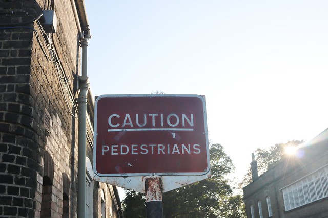
Chatham dockyard, a matching pair (I thought I posted them at the time), frame and pole look genuine, the design is the original 1933-53 red background, but the signs appear pretty recent and no font similar to what was made besides MoT font as alternatives. Any views?
 Modern replacement by David Howard, on Flickr
Modern replacement by David Howard, on Flickr