New signs made a bit like old ones
Moderator: Site Management Team
Re: New signs made a bit like old ones
Can you tell what it is yet? If not the answer will be given in 24 hours.
Last edited by DavidNW9 on Sun Aug 04, 2019 03:46, edited 1 time in total.
-
Jamesabout29
- Member
- Posts: 267
- Joined: Wed Jul 03, 2013 18:54
- Location: Benfleet, Essex.
Re: New signs made a bit like old ones
A waterway or railway line
Railway, road, sky, football, rugby enthusiast since 2001 
Proud to share a birthday with the M25!!
Proud to share a birthday with the M25!!
Re: New signs made a bit like old ones
Full points to Dave55, it is on a bridge on the Regents Canal, it's the first road type sign I've ever seen on a waterway. It looks PW style although the font is a little big and square, and the E hasn't got the middle bar as short as usual, but pretty hard to be certain. It is raised letters though but looks fairly new. If anyone knows of any others I'd like to see them but of course won't be on Streetview which is why I only found this by chance.
Here's a pretty rough hand made job made around the late 60s/early 70s in Raynes Park, oddly there is one almost the same in Glasgow.
Here's a pretty rough hand made job made around the late 60s/early 70s in Raynes Park, oddly there is one almost the same in Glasgow.

Re: New signs made a bit like old ones
If not properly PW, it's definitely a style of lettering I've seen on street name signs.DavidNW9 wrote:Full points to Dave55, it is on a bridge on the Regents Canal, it's the first road type sign I've ever seen on a waterway. It looks PW style although the font is a little big and square, and the E hasn't got the middle bar as short as usual, but pretty hard to be certain. It is raised letters though but looks fairly new. If anyone knows of any others I'd like to see them but of course won't be on Streetview which is why I only found this by chance.
British waterways instigated a system of signage for canals and navigable waterways that was derived from Worboys signs - including chevrons around sharp bends, triangular warnings for weirs and other hazards, and map-type direction signs at junctions. I've never seen a pre-Worboys style sign on a canal though.
Chris
Roads.org.uk
Roads.org.uk
-
Richard_Fairhurst

- Member
- Posts: 441
- Joined: Wed May 07, 2003 13:16
Re: New signs made a bit like old ones
BWB (as was) used the style in DavidNW9's photo for several of its earliest signs. The "look, here's a canal!" signs on the Middlewich Branch and the South Oxford, designed to be seen from the passing railway, had the same typography - though blue-on-white rather than red, if I remember correctly. Lock nameplates were also set in this style (black-on-white). I've seen it elsewhere for information signs, though can't remember where off the top of my head.
The Worboys-style signs on waterways were largely restricted to the larger navigations, mostly rivers (or river navigations like the Aire & Calder and Calder & Hebble). They rarely made it onto the historic canals, though there's one on the Trent & Mersey river section at Alrewas.
BW's "bridge and bulrushes" corporate ID, first introduced in 1990, came with signage standards, and these were beefed up when the ID was refreshed around a decade later (from white-on-black to black-on-white). The Canal & River Trust has largely retained the latter style, though with a different display typeface. The Worboys-style signs are still used on rivers, though.
Help map the world: openstreetmap.org
Re: New signs made a bit like old ones
Fascinating to learn more about the parallel system, when were the older ones made until before the others took over? I suspect the font is so close had it been on a road sign I wouldn't have thought twice including it, especially as the font changed in 1957 and also depended if pressed or stuck on letters. I wonder if anyone knows any more on the Grand Union in London and Herts, as I could get them all if there are.
-
Richard_Fairhurst
- Member
- Posts: 441
- Joined: Wed May 07, 2003 13:16
Re: New signs made a bit like old ones
Here's a couple of other examples:
http://www.geograph.org.uk/photo/1537360 - Fazeley Junction (near Tamworth)
http://www.geograph.org.uk/photo/2300635 - Foxton Locks (near Market Harborough)
http://www.geograph.org.uk/photo/3608510 - Gargrave (near Skipton) - looks brand new!
Interesting to compare two from the 1980s here:
http://www.geograph.org.uk/photo/1511058
http://www.geograph.org.uk/photo/1303352
The top one looks like a one-off. The lower one is an interesting style that BW used for a few years in the late '80s - you can date it to 1988-1990 because it says "British Waterways" but still has the old wave logo. There's still a few of these around.
And here's the current style:
http://www.geograph.org.uk/photo/3642875
http://www.geograph.org.uk/photo/1554678
http://www.geograph.org.uk/photo/2054381
It's worth noting that there's never been the consistency on the canals that the roads had. The new locks on the Sheffield & South Yorkshire (late 70s/early 80s) have unique nameplates, for example.
Help map the world: openstreetmap.org
Re: New signs made a bit like old ones
Thanks Richard, they basically look like variations of fingerposts, I think a warning type is probably quite a find considering, especially of that style however old it really is. If someone else hadn't taken it and had a single term search which could raise it I'd never have got it either.
Re: New signs made a bit like old ones
I don't even think this was a private road, but they've got a local resident to paint this rather than use a proper metal sign. Had it been a real one it would have been a really nice catch but it's just home made.
Re: New signs made a bit like old ones
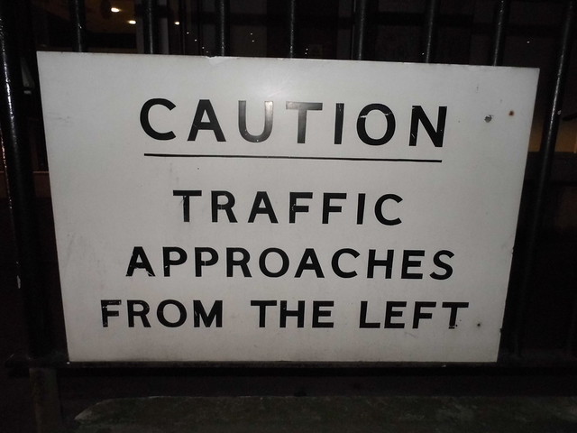
Only the second council issued direction sign I've come across, this uses the road name font to include directions on a single sign. It does what it is designed for, but not very pleasing on the eye looking at serif fonts and Worboys arrows mixed. Some things just should not happen.
Re: New signs made a bit like old ones
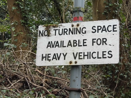
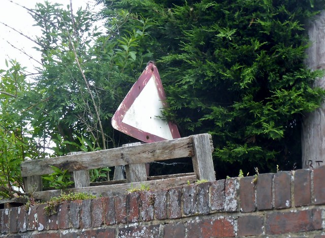
This isn't made like old signs, but not like new ones either so had to put it somewhere.
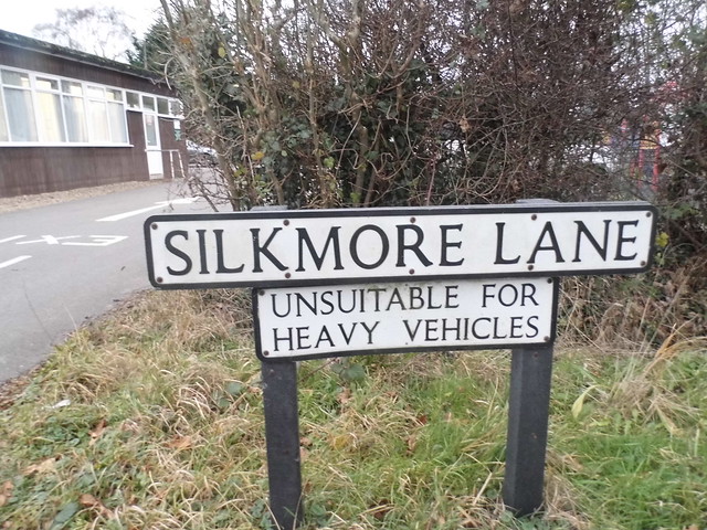
I've worked out the council can apply to make a nationally issued sign if it's attached to a road name, presumably to keep the local designs the same. The one on the other corner was all on one unit, this uses the current wording (it was 'traffic' pre-1964) and looks pretty new. I haven't come across many council issued national type signs but there's a set of direction arrows in Biggin Hill exactly the same as this at least which are also under the road name so have discovered new rules which are rarely but definitely applied.
I've worked out the council can apply to make a nationally issued sign if it's attached to a road name, presumably to keep the local designs the same. The one on the other corner was all on one unit, this uses the current wording (it was 'traffic' pre-1964) and looks pretty new. I haven't come across many council issued national type signs but there's a set of direction arrows in Biggin Hill exactly the same as this at least which are also under the road name so have discovered new rules which are rarely but definitely applied.
Re: New signs made a bit like old ones
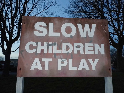
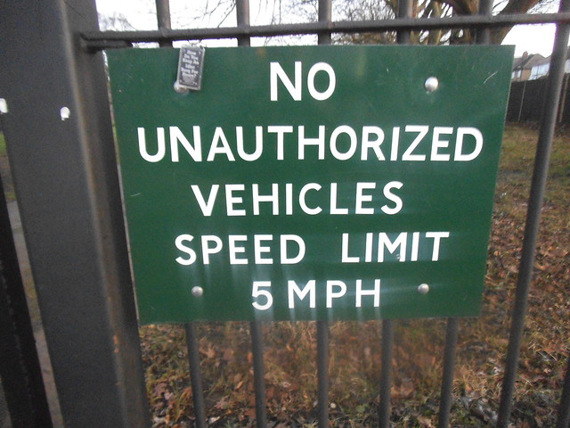
I knew this was a private sign as it refers to persons rather than pedestrians, and keeping them out rather than directing them. Also public road signs do not refer to unauthorised anything as the roads are for everyone, and only restrict certain types of vehicle. However, old signs made in the official style are still collectable, but on close inspection this is simply a locally made piece of poor quality materials, having rusted and faded almost to nothing and quite probably only about 30 years old.
The E is the proof as the middle bar is the same length as the other two, and the tail on the R is too long and sticks out proud of the rectangle around it. It's at the entrance to Canons Park playing fields, now Barnet FC.

The E is the proof as the middle bar is the same length as the other two, and the tail on the R is too long and sticks out proud of the rectangle around it. It's at the entrance to Canons Park playing fields, now Barnet FC.
Re: New signs made a bit like old ones
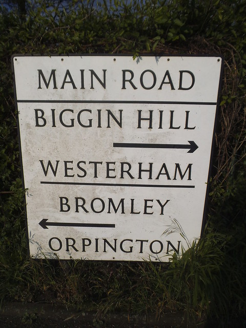
My guess is this replaced a far older one and simply used the current lettering which looked closest but wasn't that close. If anyone can tell me how you can prove it I'll leave the answer open for a while.
Arnos Park, Southgate
Arnos Park, Southgate

Re: New signs made a bit like old ones
Pity tge sign also fails to use Anglicised spelling...
Bryn
Terminally cynical, unimpressed, and nearly Middle Age already.
She said life was like a motorway; dull, grey, and long.
Blog - https://showmeasign.online/
X - https://twitter.com/ShowMeASignBryn
YouTube - https://www.youtube.com/@BrynBuck
Terminally cynical, unimpressed, and nearly Middle Age already.
She said life was like a motorway; dull, grey, and long.
Blog - https://showmeasign.online/
X - https://twitter.com/ShowMeASignBryn
YouTube - https://www.youtube.com/@BrynBuck

Re: New signs made a bit like old ones
What do you mean? It's Standard English, rather than some poncy Frenchified nonsense.

Re: New signs made a bit like old ones
Bryn666 wrote:Pity tge sign also fails to use Anglicised spelling...
Make poetry history.
Did you know there's more to SABRE than just the Forums?
Help with maps using the new online calibrator.
Add your roads knowledge to the SABRE Wiki.
Did you know there's more to SABRE than just the Forums?
Help with maps using the new online calibrator.
Add your roads knowledge to the SABRE Wiki.
Re: New signs made a bit like old ones
I noticed that as well Bryn, also a diversion from all official sign spelling although it is an allowed and actually older alternative it is not one supposed to appear on British road signs.
The dead giveaway (besides the fresh-off-the-press condition) is the 5. The other lettering (the E especially) could be considered a copy of the old style, possibly an earlier rusting version, but hadn't a clue the difference between the old 5 with a sharp corner and the Transport one with a flat corner. It's actually issued presumably by Enfield Council as it's a public park.
Here's a psychedelic one, old but indeterminate, on a major road in Sunningdale. It appears to be stencilled from a template as it's far too clear to be hand painted and varies too much to use anything from a set, the letters even vary within the same words.
Re: New signs made a bit like old ones
Easily one of the naffest efforts I've ever come across, hand made and planted in someone's garden in East Peckham poking out above the wall with no known function.
Re: New signs made a bit like old ones
A Blue Peter type homage to pre-Worboys by Moorgate Station, which is actually made on a piece of melamine kitchen shelving. And look at the font, I can't tell if it's stencilled (as the letters are uniform) or stuck on, but it's pretty naff.